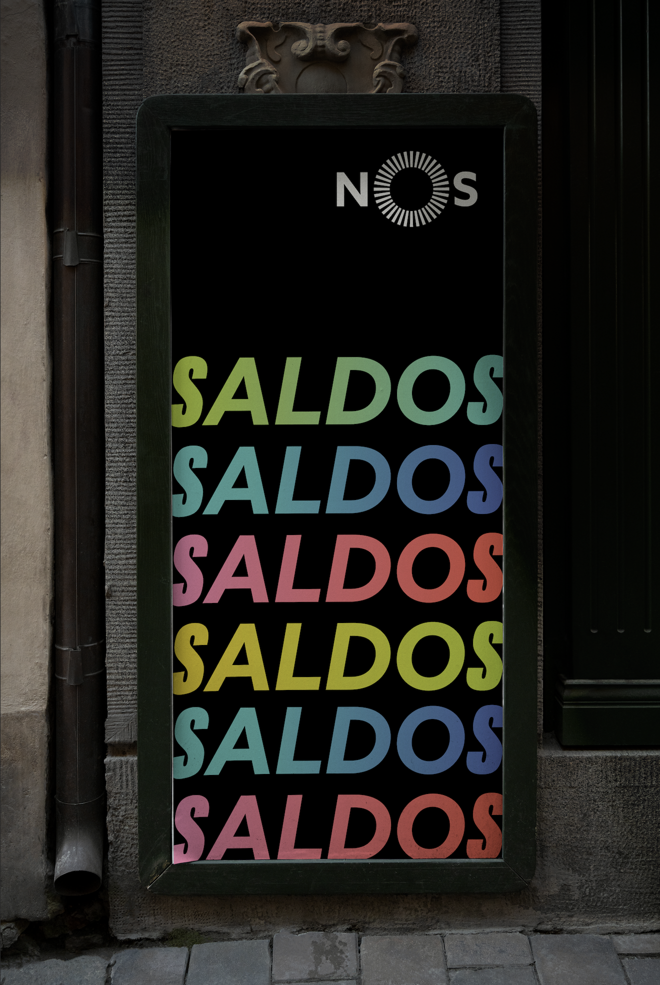
"Aqui para NOS" (“Just for US”) is an innovative campaign that aims to position NOS stores as unmissable shopping destinations during sales and promotion periods. Based on the idea of exclusive secrets and irresistible discounts, the campaign encourages customers to feel part of a select group of "smart shoppers", while reinforcing NOS brand identity. With a dynamic visual approach and innovative promotional language, "Aqui para NOS" seeks to create a unique experience for customers, cultivating a sense of exclusivity and belonging, while attracting new consumers looking for great offers.
what i did
strategy, design and art direction
creative strategy: Gabriel Marcon
communication strategy: Havas Portugal
printed graphics: Gabriel Marcon and Teresa Callé
copywriter: Gonçalo Paiva
artworker: Miguel Cardoso
client: @nosportugal
Following a transversal logic, the solution for the Visual Identity was based on three pillars:
A proprietary chromatic approach, but innovating with the use of gradients, that were never used before.
An exclamatory typography, with the use of the brand's font in italics, but with some of the letters redesigned.
A bold and appetizing symbology, distinguishing the image from what already exists on the market when it comes to sales.


